
Michael Worthington is a experimental with is work in design.He believes that true experimentation is about taking risks and I agree with him on that assumption that you have to be inquisitive, believing that you can create something that does not already exist, being willing to make mistakes, take those mistakes as learning experiences that can move you into a process that allows you to create something unfamiliar. Their should be no expectations what form should in be in the experimentation of the form. I think that should be applied in design in general because if not you allow yourself to create a form that probably been seen before or even worse cliche.
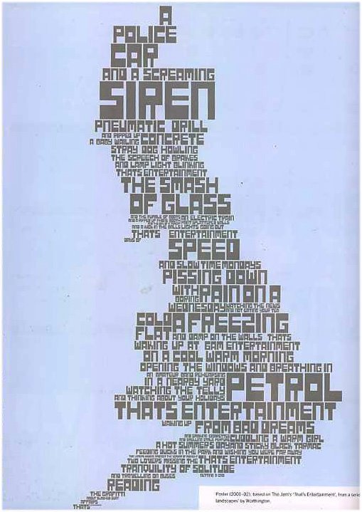
Poster {2001-02}, based on The Jam's "That's Entertainment', from a series of typographic landscapes' by Worthington
Its pretty interesting how the type forms a gestalt with typography. I like how he visually interprets the sounds and translates it to the hierarchy of the type. By this I mean if you look at A POLICE CAR and A SCREAMING SIREN it really communicates what it says visually. The play on hierarchy with the typography is rhythmical, in that in seems to escalate and diminish in pitch corresponding to the action that is occurring. Sound waves manifest themselves through visual communication in this piece.
The Smiths' Reel Around the Fountain' the other piece
The layering of typography and the transparency of the type is very appealing to me. The asymmetrical composition is more interesting to me because its not centered and its not symmetrical, I find that the more interesting designs are asymmetrical. His understanding hierarchy is apparent in his use of typography, and it has a very strong dynamic feel compositionally. This dynamic is shown through the primary information because it seems to cut wright into the secondary information and overlay it at the same time. And it tends to become almost illegible and complex where the information merges together by the layering of the transparencies of type.
2 comments:
Michael Worthington's artwork also caught my attention. His use of typography is unlike anything that I have seen before. His designs really reflect his idea that "true experimentation means taking risks." When I first look at his typography, I see it as an image first, then I see it as text. At first it seems as though it might be diffucult to read, but most of his typography is very legible.
I like how his typography is described as "typographic landscapes." I never really thought about typography as being like a landscape, but it is an interesting way to think about hierarchy. When I look at the "That's Entertainment" piece, I really see it as a landscape. The larger, thicker text makes me think of mountains and reads as important information, and tiny text creates a pattern that reminds me of a dry, desert terrain. His typeface choice in this piece, and in some of his other pieces, seem like he created them himself specifically for each design because thay complement his designs so well.
i agree that this is indeed a very intriguing artist. there is indeed a sense of rhythm that gets passed on through the treatment of the type. the first image is layered, but because of the scale change, colors, and opacity variations, we still feel like it is echoing in our ears. because worthington does have lots of experimentation that led to his final works, we see that indeed, you cannot plan out what you want in the end. i think that is whats hard for most people to internalize...because we are usually told in life-- "plan ahead, think about the future" while you must do a bit of planning to a certain extent in design, we cannot always confine our creativity like that. in order to get extraordinary results, we need to take extraordinary steps.
Post a Comment