
design: Andreas Laeufer
project: Mined
To open is to destroy. The cover is nothing more than shrinkwrapped polythene - the yellow block on the front is in the fact stuckon to the plastic. The book does not seek to hide the industrial techniques in its production; the binding is raw and exposed. The pages have not been trimmed down which means would- viewers require a lot of commitment. Not only do they have to rip off the cover, they then have to tear the pages to see the content. Sandwiched in the middle of the thick volume are 'tools for life' -a pair of scissors and some thread. Are they there to assist with the healing necessary after the many acts of destruction the reader must carry out to access the book itself?
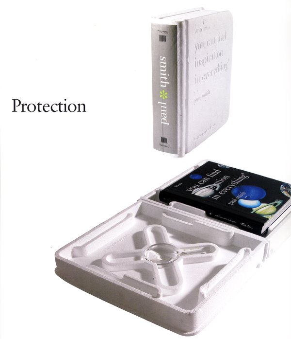
design: Aboud Sodano (case:Jonathan Ive)
project: You Can Find Inspiration in Everything
Expanded polystyrene is used as the outer packaging for this book about the British fashion designer Paul Smith. The form echoes that of a large leather-bound volume. The packaging provides more than just protection for the book during shipping; it becomes a kind of dust jacket that is both disposable and cherishable. Inside this custom case, the polystyrene structure carefully holds in place the book itself, which comes in a variety of cloth covers, all cut froma selectionof the designer's textiles. In fact, owing to the varying crops of the different clothes, eachcover is unique. The buyer has no idea what his or her cover will loke like until the protective case has been cracked open.
The casing also houses a Paul Smith branded magnifying glass, partially as a visual pun on the title of the book: 'You Can Find Inspiration in Everything' - And If You Can't, Look Again!'
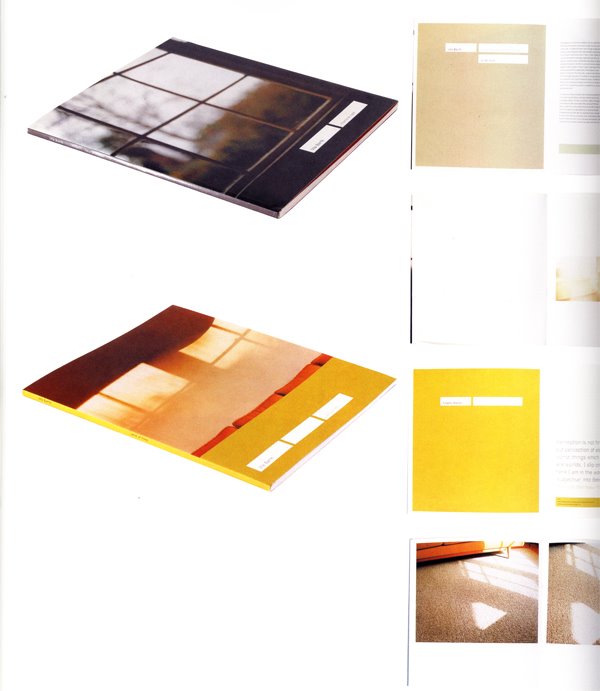
design: Michael Worthington
project: Uta Barth: Nowhere Near & Uta Barth:..And in Time
These two books, produced in 1999 and 2000, show the work of the photographer Uta Barth. The same design scheme has been used in both. This set the often bleached-out images in large areas of text-free white space. Both volumes have essays at the back; these are set using a palette of muted, pale colours that reflect the hue of the photography.
design: Michael Worthington
project: Uta Barth: In Between Places
Containing essays, gallery views and full-page images, this book has a variety of paces. Full-bleed images continue on preceding and following pages, contrasting with much smaller reproductions which are given ample space in which to breath.