
Fuse 14: Cyber (1995)
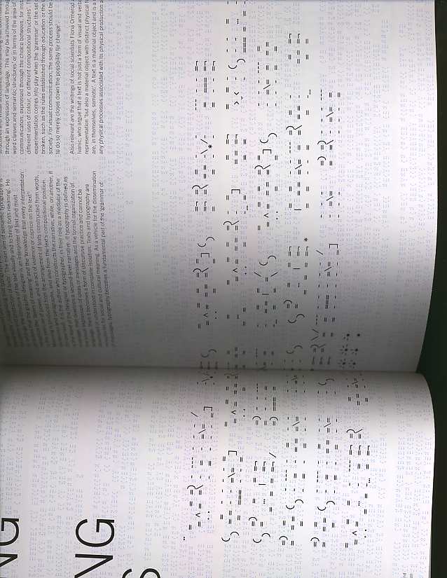
A berlin based group developed a really interesting typeface that challenges readability and a attempt to bring emotion into the medium of cyberspace. It's like a coded message that can only deciphered if you really take the time and analyze it. What I found interesting about the reading was main aim of semantic typography is to arrange the structure of the text visually and to bring forth meaning. As a mediator of messages the graphic designer or typographer must recognize the the " layers of meaning" this plays a vital role in the dissemination of the information. A additional layer of meaning can be explored other than literal meaning, recognition through cultural contexts through the alphabetic forms not just through the word.
alphabet (1992) for Fuse
What was very intriguing and experimental about this typeface was that it employed the human body as a physical 'sign', and taking into account gestures and expressions to give the reader clues for the letter they represent. Wow, a alternative to the visual grammar that we are so accustomed to seeing. Alphabets are supposed to read and at the same time a set of individual photos expressing a second linguistic narrative based on the sitter's cultural and social identity through the clothes they wear.
2 comments:
I thought it was very interesting how the Berlin group developed that typeface. Indeed, it does challenge the readability of the text, but in doing so, it also manages to get the reader to feel like a spy who has to decipher a message that has been written in some secret code. I'm sure we've all done some silly things like this on the computer when use symbols on the keyboard, and make certain combinations to create a larger picture.
Oh, and now I see what the photo's were...at first i thought you were still on your last subject of using found objects as artifacts to document certain days and times in one's life. But I see now that they are visual clues that are connected to your post. It is an interesting concept to connect these two things, people, and the alphabet.
The creation of a typeface is an interesting process. When I think of a typeface, I usually think of the actual alphabet that is designed in a certain manner. However, I dont usually think of a typeface as being photographs of people. The typeface that was designed around people's expressions and emotions is really interesting. It makes me think about how I interpret these photos as a typeface. Does each photo represent one letter? one syllable? one word?
Post a Comment