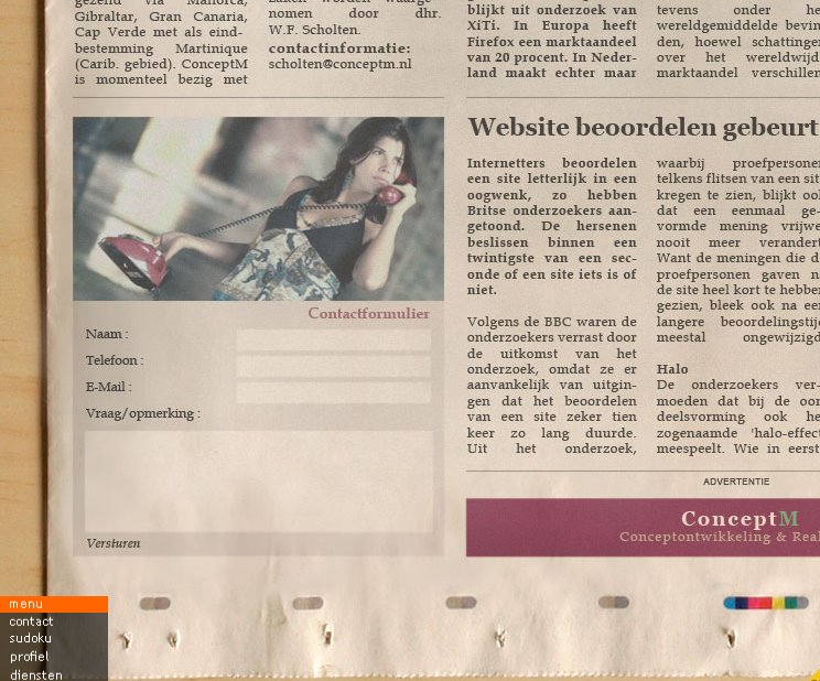

I like this flashsite because it really tries to experiments with the conventions of website navigation. The news paper is the container for its information, the user navigates its content by mouse {clicking and scrolling}. After you get to the destination specified, a pen animation circles the heading of the location. Its a coincidence that the posters that I am designing have a lot in common with this flashsite, whereas both deal with new media and old media and how it communicating to its audiences through its use digitally and traditionally. It is also pretty interesting that the buttons for the photography is in the content of the photographed newspaper.
http://www.conceptm.nl/
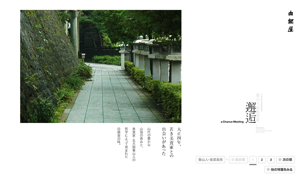
This site is very clean and professional, whereas the use of white space is designed in a modern form that follows the function of it. The photos are displayed in sequential fashion but have subtle thing that goes on with the photo that entails a screen that disappears with ever consecutive photo shown. I really like navigating the photos, because the space that the information occupies changes in different ways and which keeps it dynamic. Structure plays a interesting part with the axis lines that are created with the characters and are used to organize and group the information that one navigates. This flash-site makes me want to learn Japanese so I can understand its valuable content.
http://www.shiroganeya.co.jp/